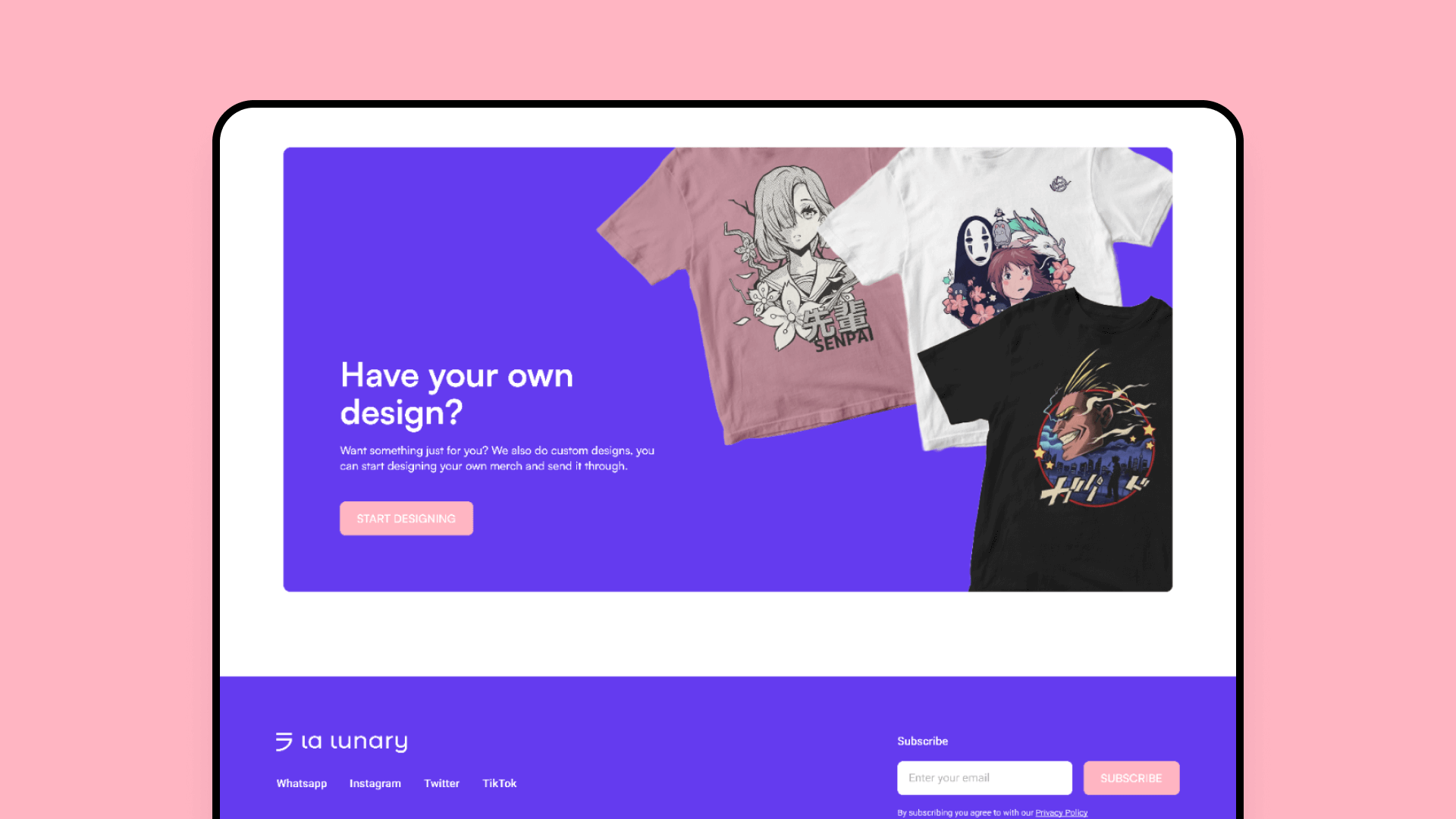
La Lunary
Escape the ordinary
La Lunary is a South African brand that provides stylish inspired-by anime merchandise, and anime cosplay items and makes custom clothing suited to the customer’s needs
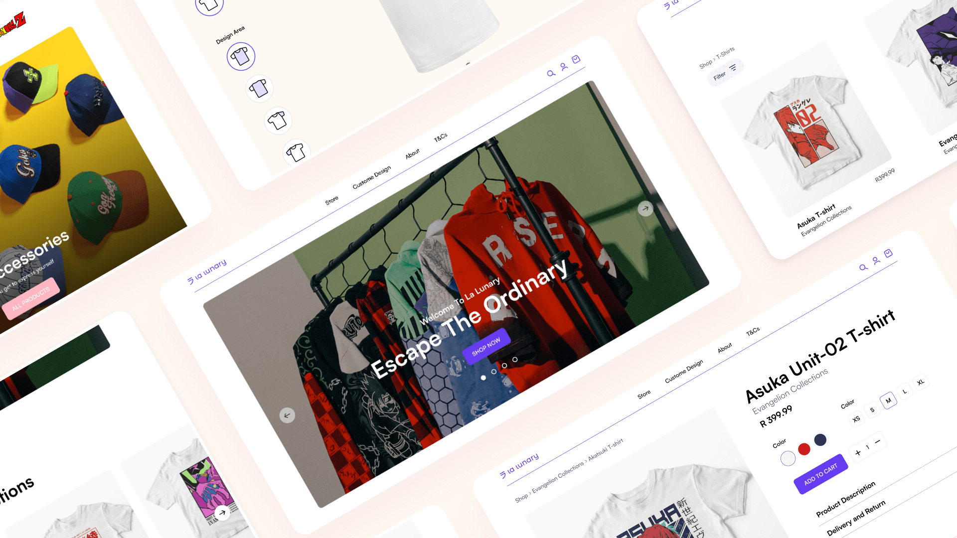
New face to anime merchandise
La Lunary has been operating for several years but has been struggling with low
sales and poor customer engagement. The site’s experience was outdated and not
user-friendly, leading to high bounce rates and low sales. The owner was looking to
revamp the platform’s experience to drive more traffic and increase conversion.
I was brought in as a UX designer to lead the redesign effort and improve the
platform’s user experience. I worked with a team consisting of user-researchers and
designers to identify user pain points and design a solution that would drive more
traffic and increase conversions.
Gaining insight & empathy
Initial research focused on better understanding user pain points in using the platform, from finding products to completing order, as measuring the extent to which these pain points are shared among their peers. The main area of focus was on how do users interact with the existing product and essential features users needed.
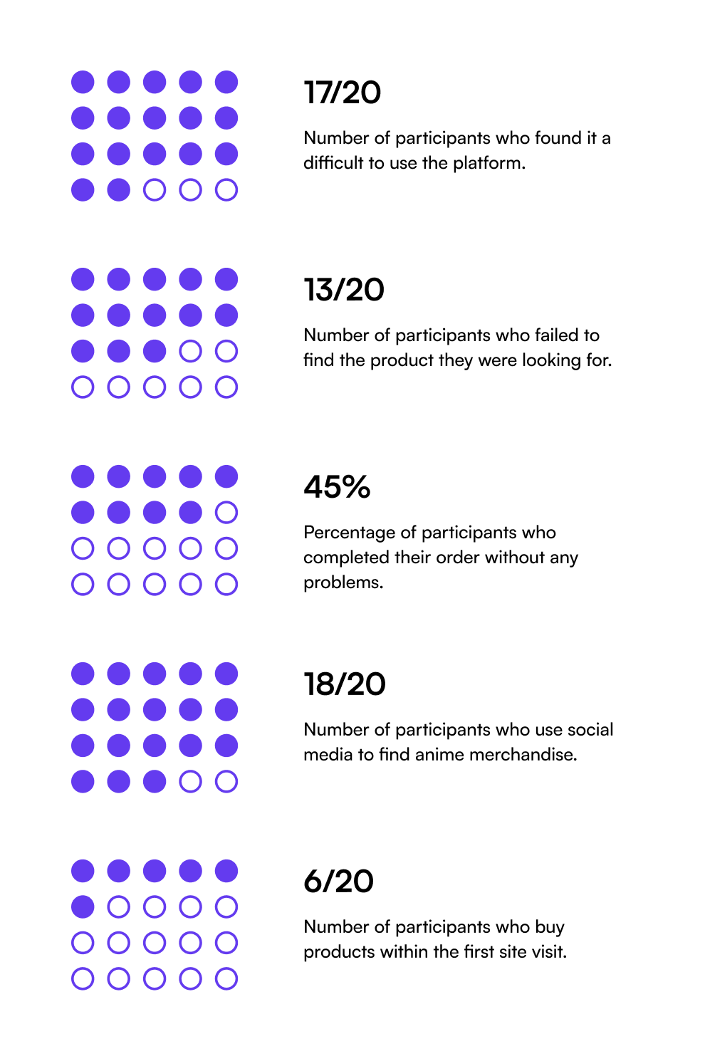
A survey was conducted on 20 participants to identify paint points and essential features
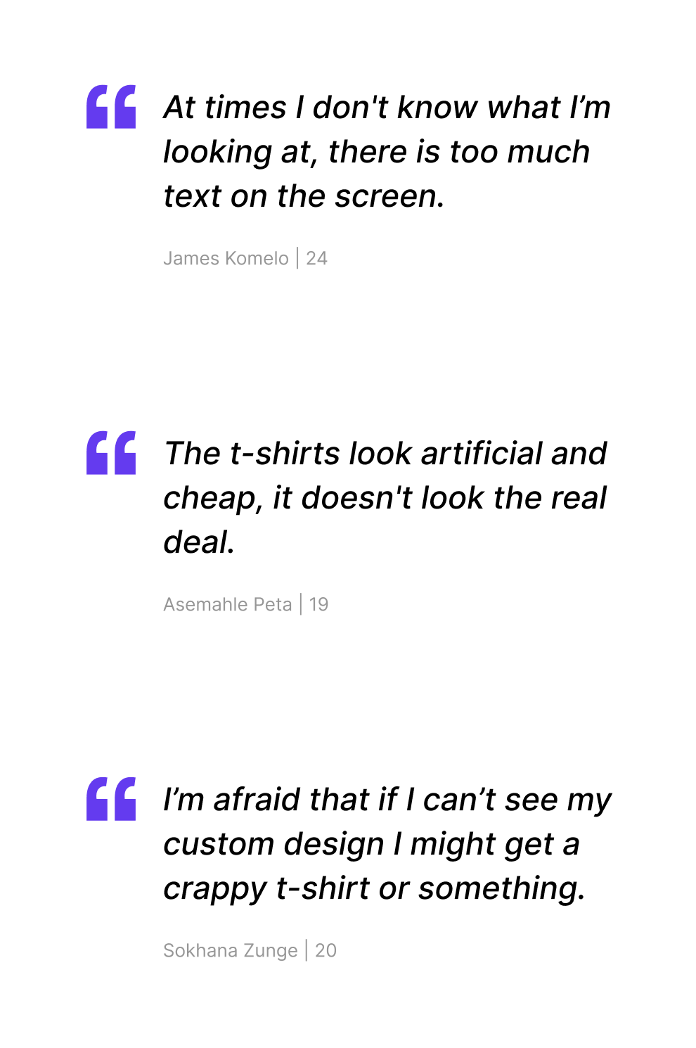
Conducted 5 participant interviews to identify pain points so as to improve the experience.
Key takeaways
Too much information on screen makes users feel overwhelmed, they'd like a more curated experience
The site lacked desirable features and felt impersonal, outdated and untrustworthy.
Most users want to see product review of some kind of show case with real people.
Building the project’s foundation
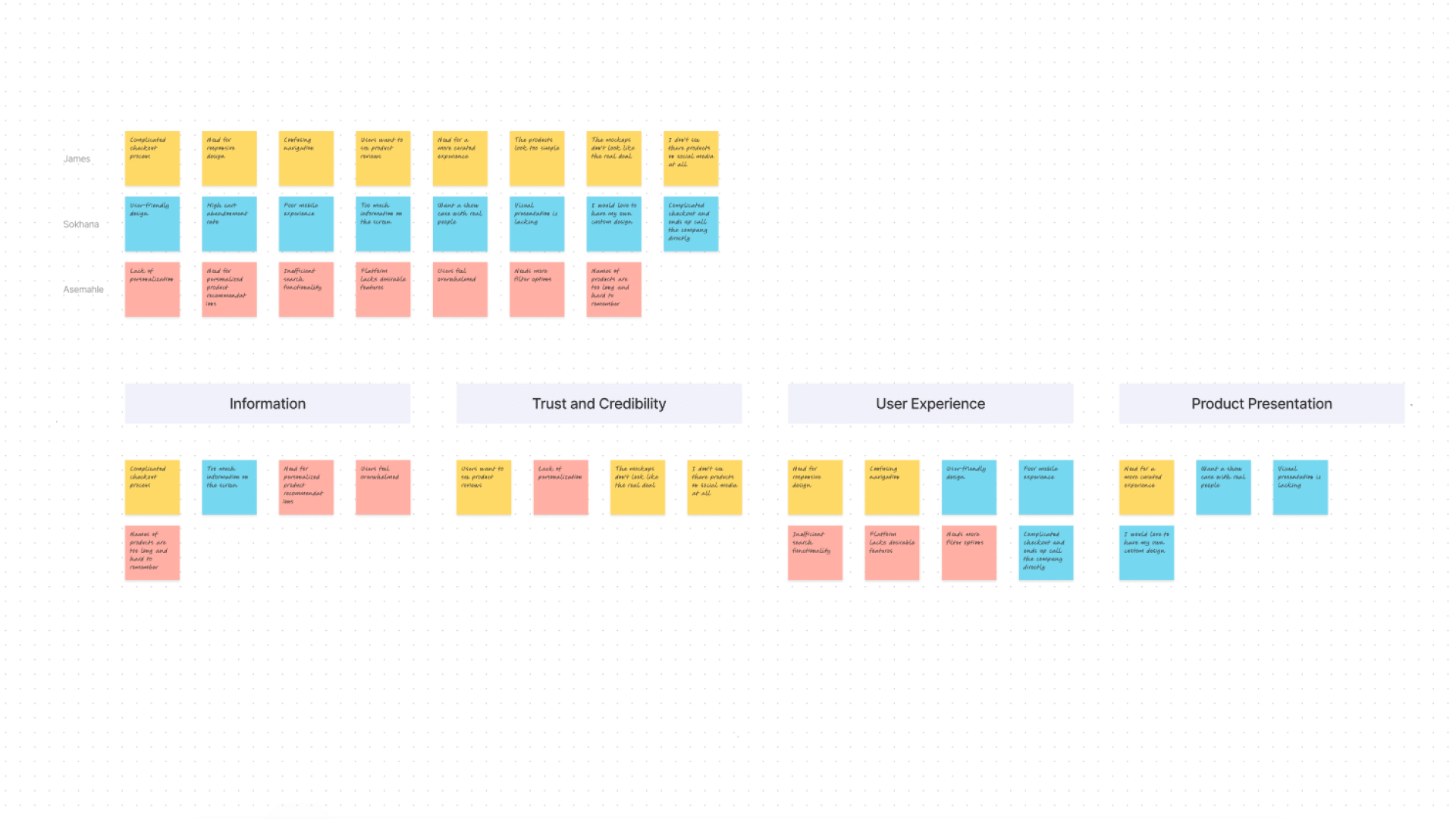
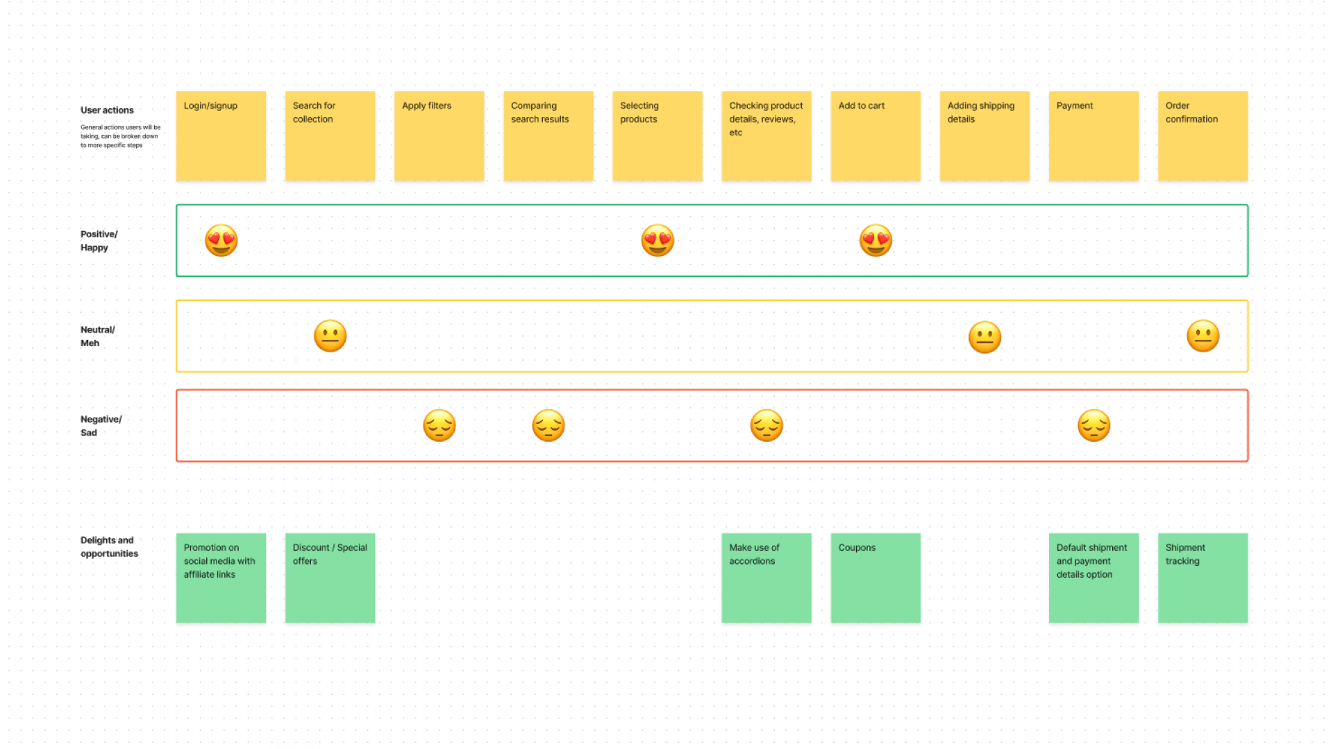
After conducting user interviews, all the participants responses were synthesized to identity themes, opportunities, and features that La Lunary could focus and improve upon.
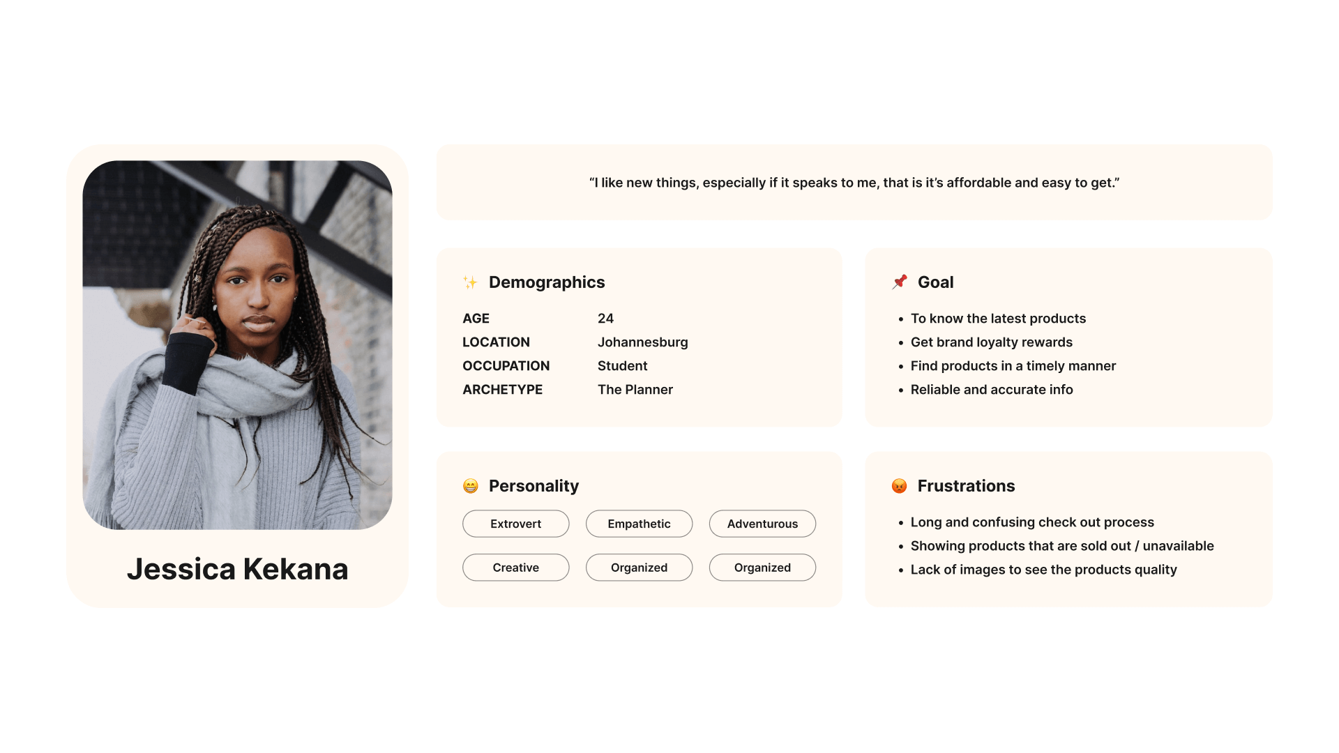
A persona was built based on the data collected to help drive decision making and keep the product focused on solving users pain points, frustrations, and goals.
Exploring the possibilities
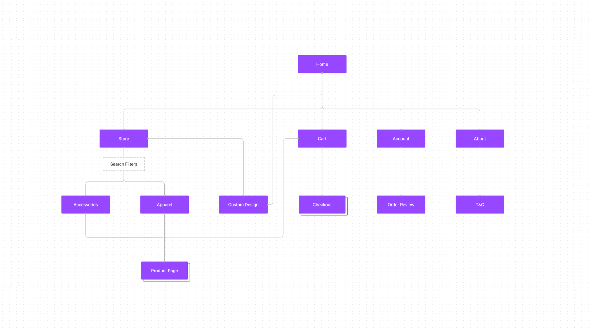
Quick sketches helped me to get my ideas out of my head to determine which pieces were essential for each screen at the beginning of the design process.
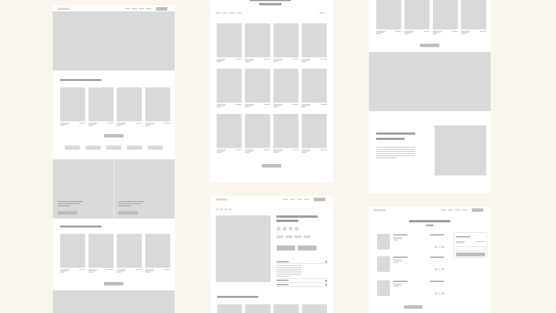
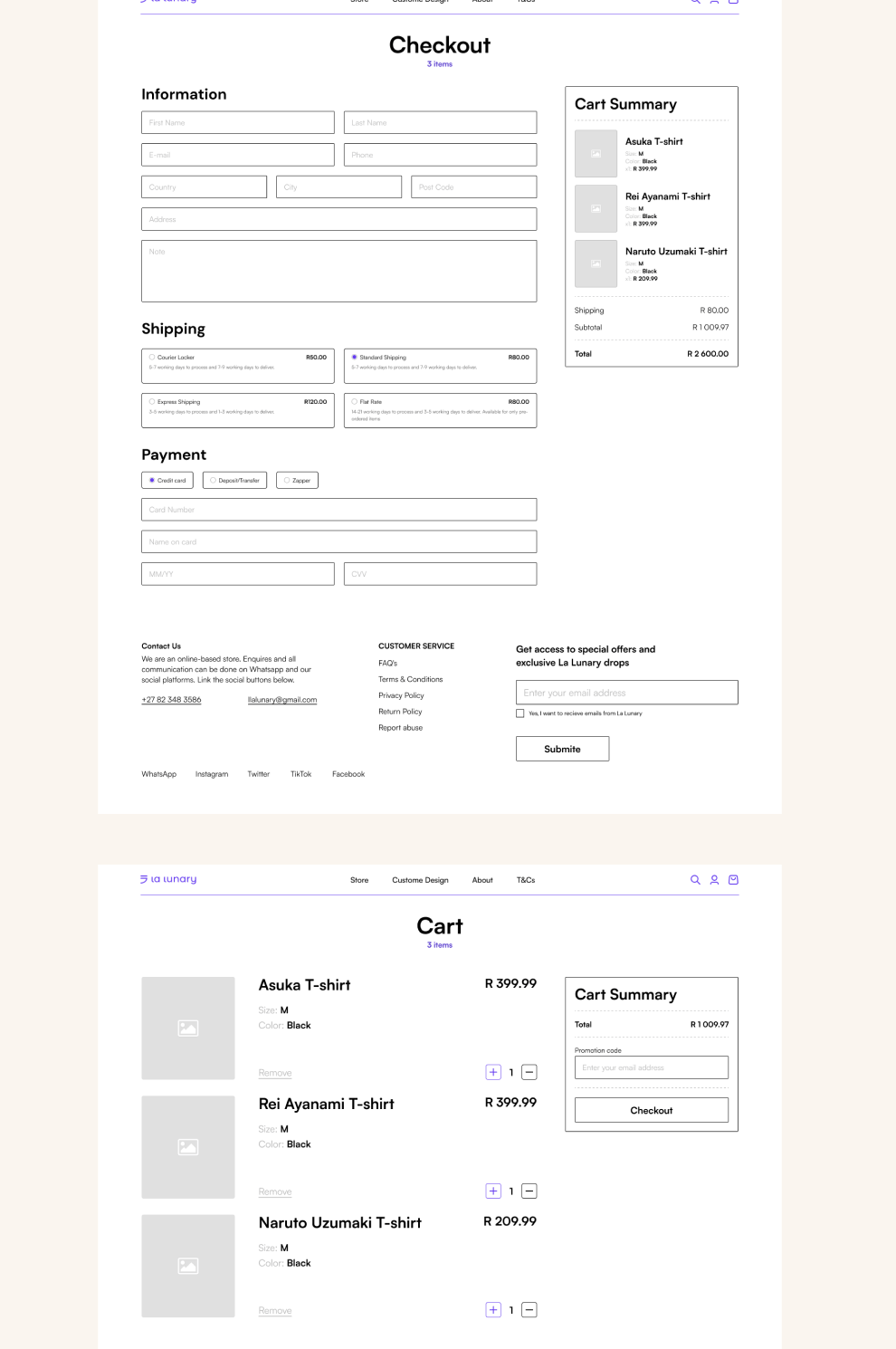
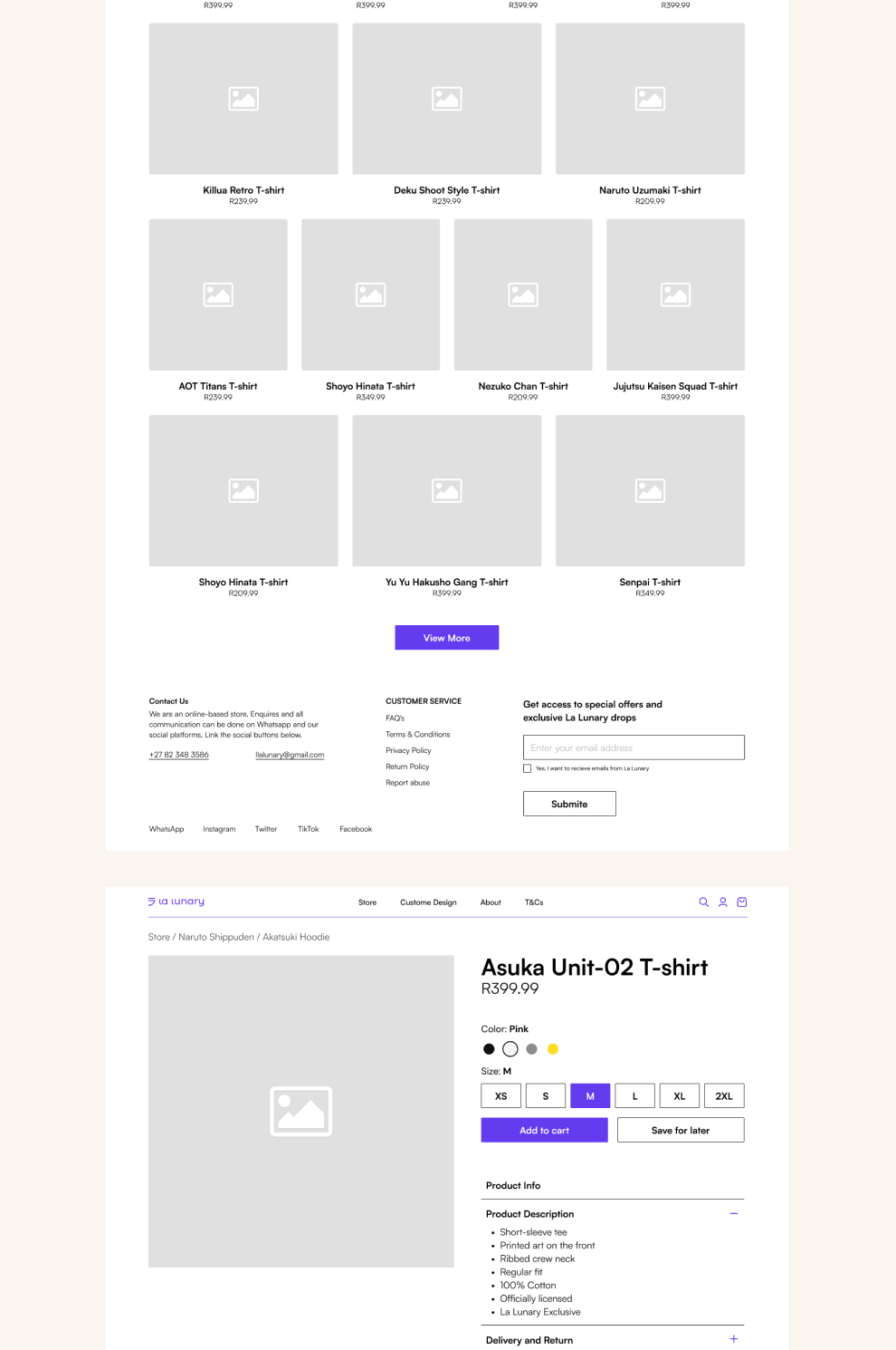
Low-fidelity prototypes used for user testing.
Quick sketches helped me to get my ideas out of my head to determine which pieces were essential for each screen at the beginning of the design process.
Pain points
Users could not preview their custom design.
Checkout page was overwhelming.
Long product information was overwhelming and boring.
New ideas
Use an interactive 3D view of the product with the custom design
Split checkout into smaller, sequential sections.
Reducing information to short bullet points.
Creating a fresh and pleasant experience
We crafted a new brand identity, a solid design system, and a custom website that would show off their new look and feel. The focus was always on the user experience, making sure it was cohesive, consistent, and enjoyable. We wanted visitors to have a smooth experience and be able to make informed decisions with ease.
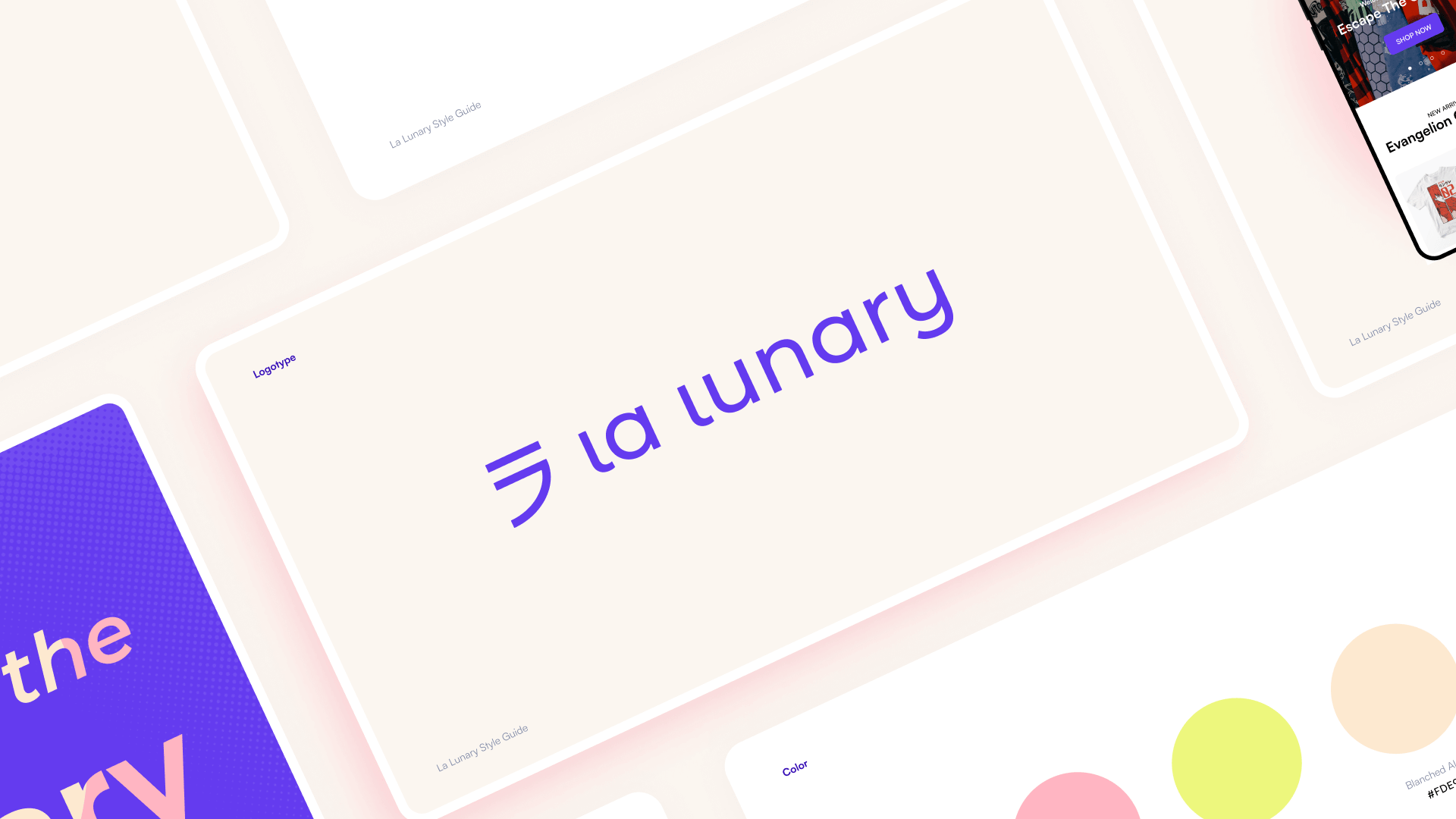

The first task was to give a makeover to La Lunary’s logotype and identity.

Fun fact, the symbol is the Japanese character for La.
A focus on simplicity
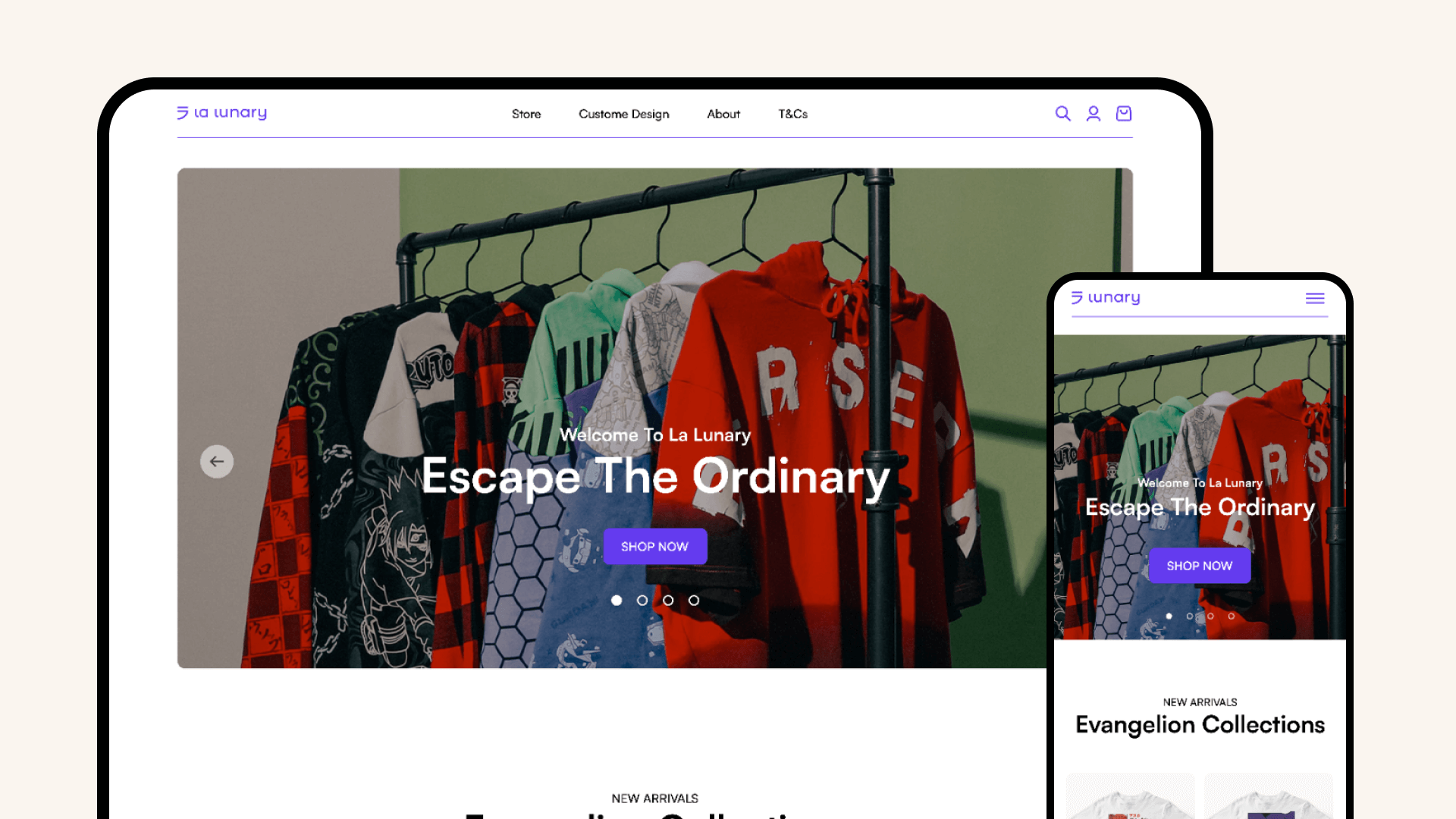
With a clear understanding of the users, we developed a design system that was used to design a solution that is minimal and has repeating layouts that create learnable patterns throughout the platform.
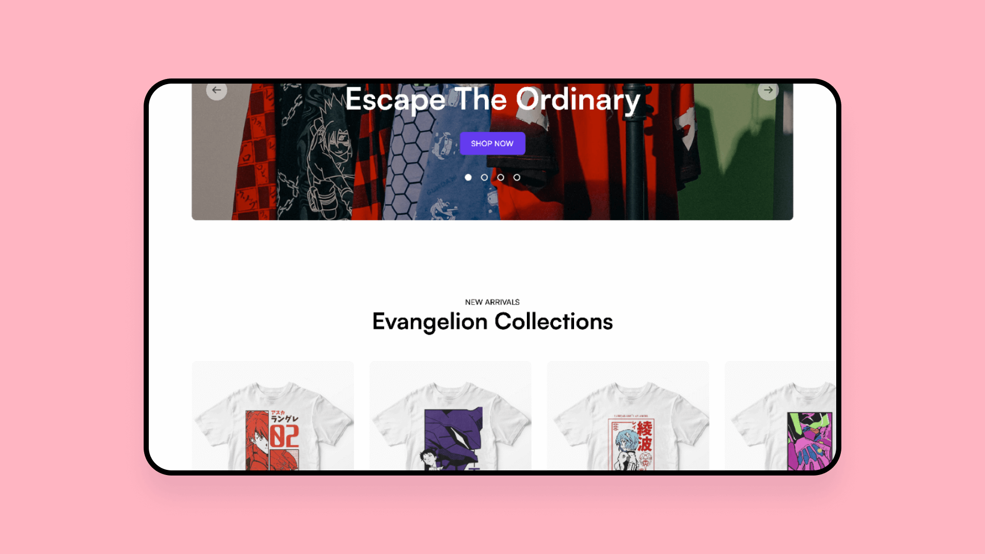
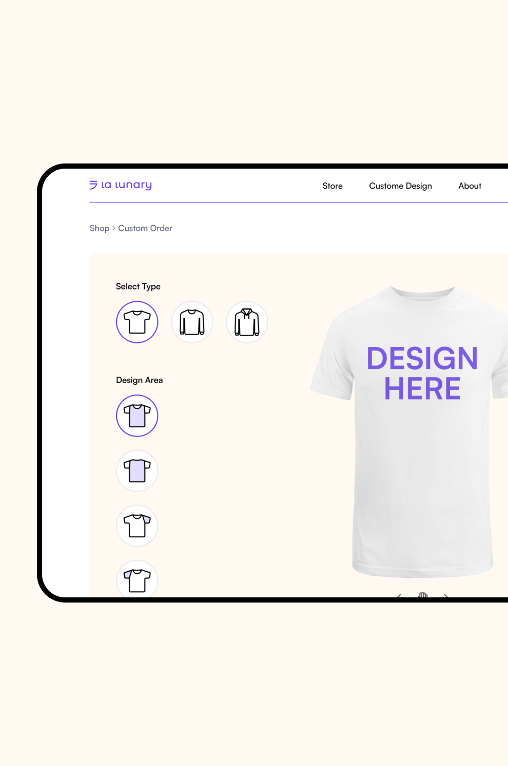
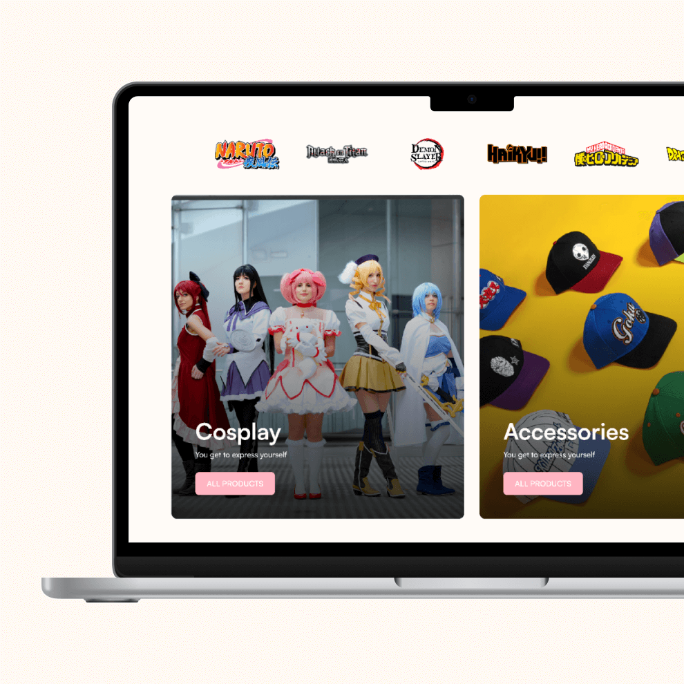
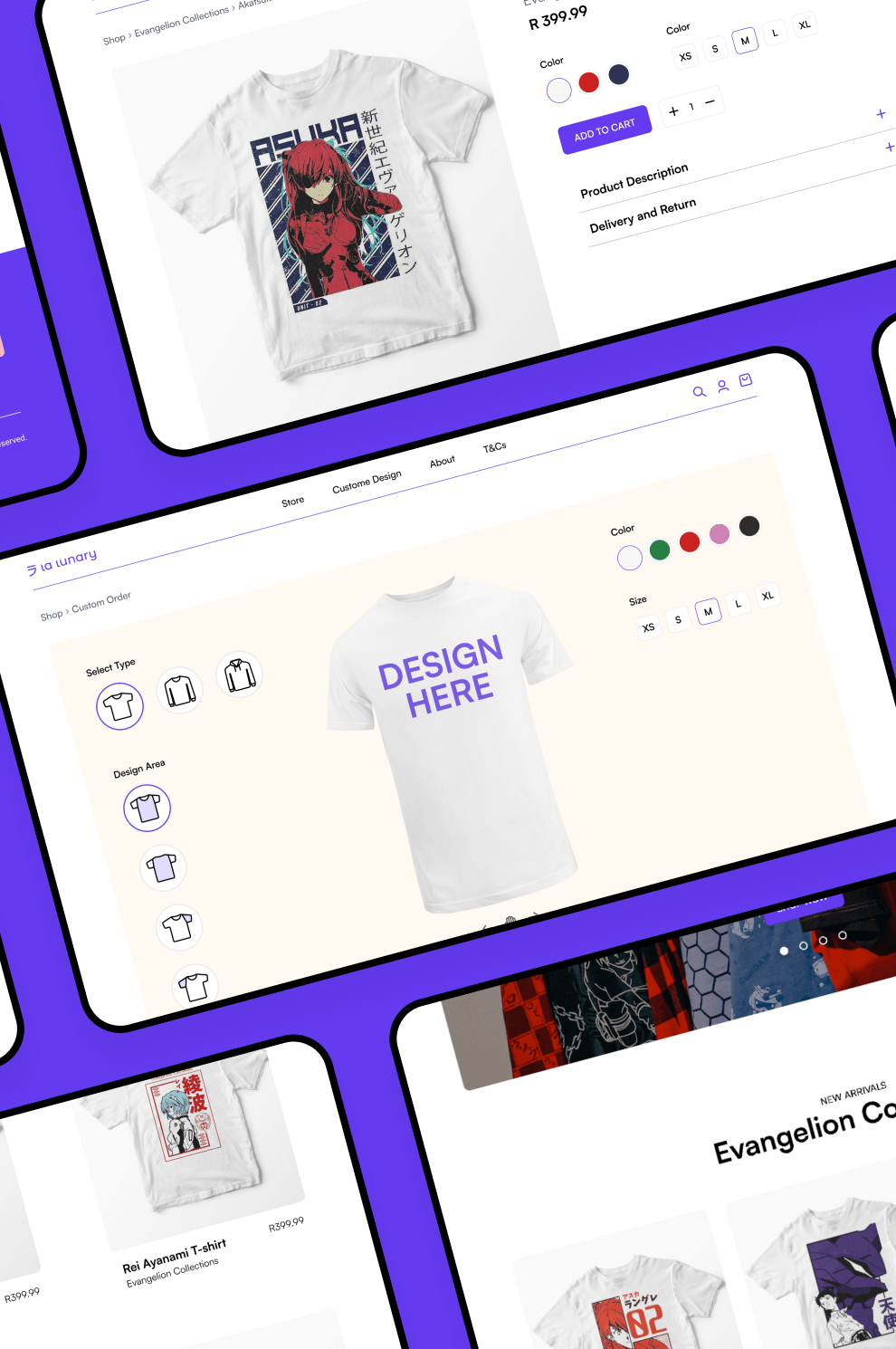
The website allows the creation of customised orders with instant 3D preview.
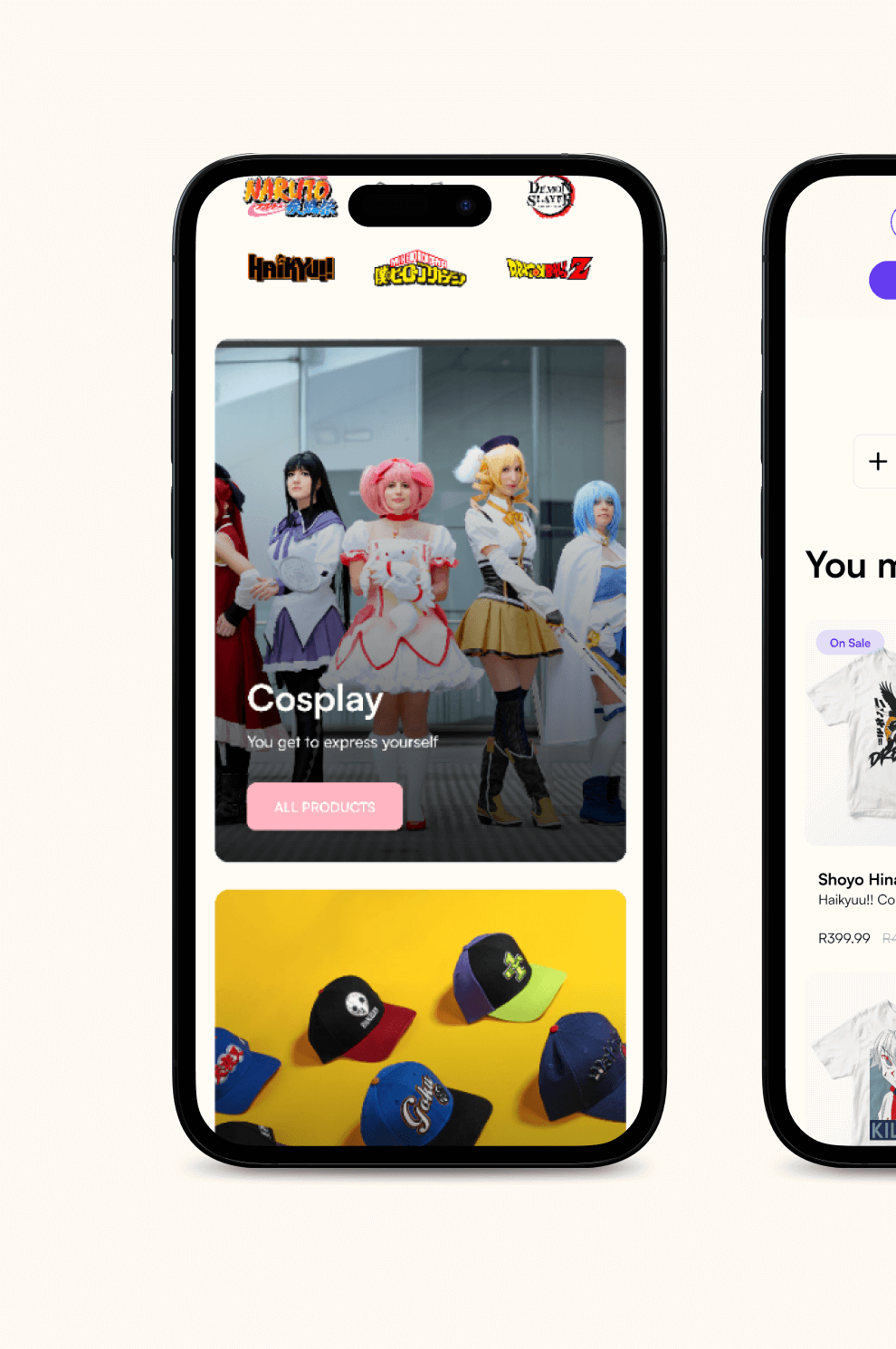
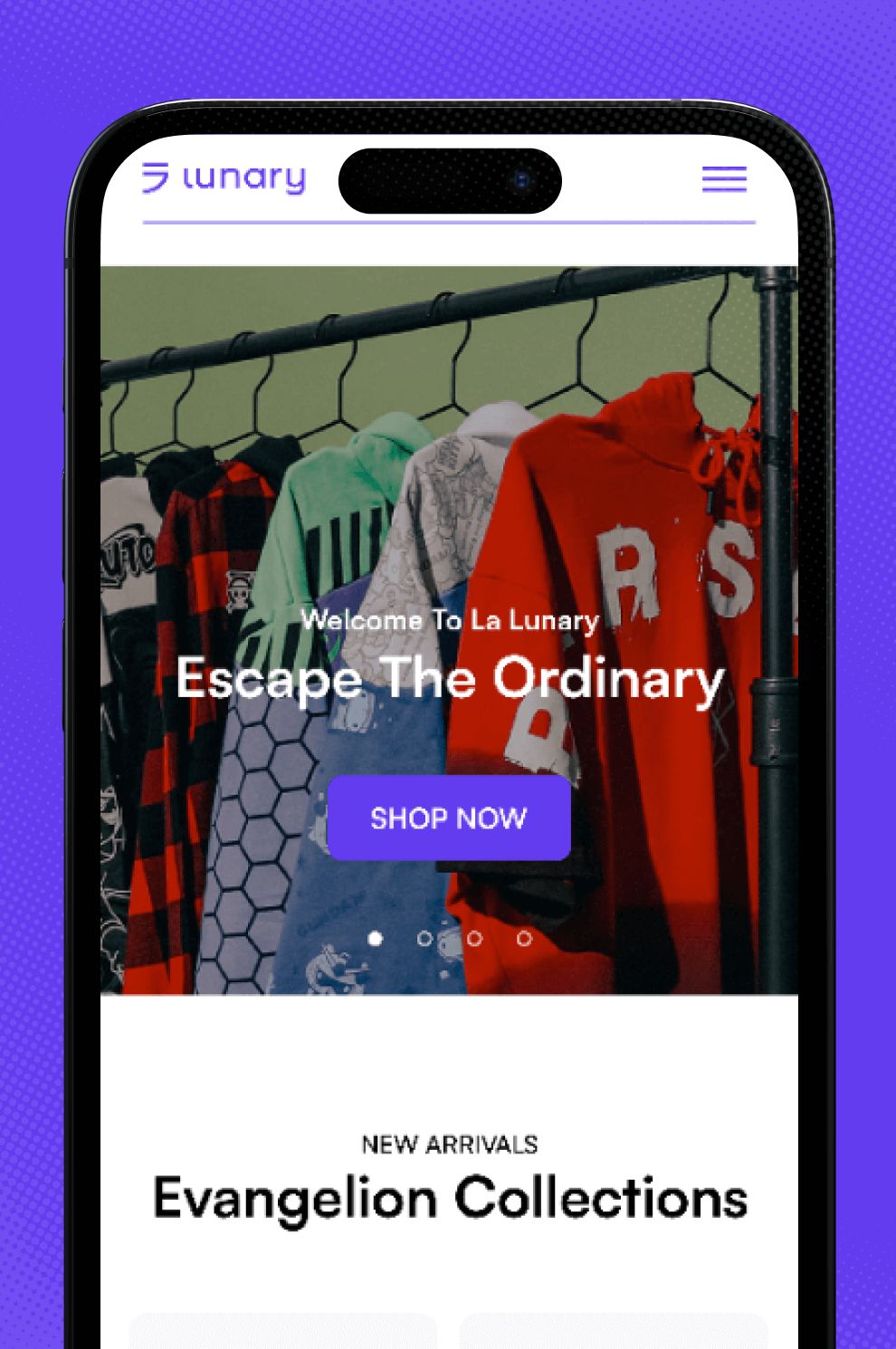
Web version adapted for smartphones.
Not just another online store
Our objective was fully attained. The website for La Lunary shows a product that is user-friendly and has led to an increase in engagement, which has resulted in an increase in sales.
